
Behind the Badge: Is Saturn’s Logo More Than What It Seems?
Learn what the Saturn emblem could actually be...
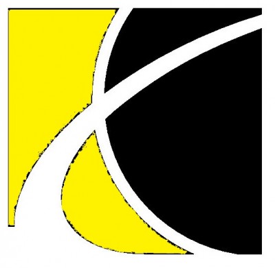
Saturn’s odd logo is a bit of an optical illusion
Photo: Dino Abatzidis via CC
I’ve seen the rise and fall of the Saturn brand, and–frankly–its logo has always stuck out to me.
For only being around 25 years, Saturn made waves in the automotive industry. Its short-lived enterprise truly lived up to its slogan of being “A Different Kind of Car Company.” That phrase easily applied to its odd emblem too.
It takes some squinting and head-tilting, but you’ve probably noticed that the image with two sweeping arcs looks–fittingly–like the planet Saturn. While that interpretation is what most people assume, could there be something more going on behind Saturn’s logo?
DIY Help: Common questions about changing your car’s oil
The Rise and Fall of the Saturn Logo
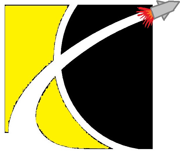
In case your eyes never figured it out, here’s a simplified image
Saturn was launched in 1985 as a subsidiary of General Motors to stave off Japanese imports flooding the North American car market. By emulating foreign market strategies and distancing itself from GM, Saturn quickly became a success. After winning awards and becoming profitable, Saturn was overtaken by GM’s micromanaging, removing the brand from its roots and driving it into closure in 2010.
Most people can agree the Saturn badge looks like the planet which shares the same name–specifically the lower-left quadrant of the sphere. That or it looks like a big “X” running to the left!
The logo has drawn some criticism for being red, as Mars is widely recognized as the “Red Planet,” while Saturn is actually pale yellow. Admittedly, red stands out much more.
The astrological symbol for Saturn also has an arching crescent, a sickle representing the harvesting of an old regime and the enthroning of a new one.
The one and only Saturn logo
Photo: Im Saturn via CC
However, the company wasn’t just named after the planet; Saturn was actually the name for a series of rockets used by NASA between 1966 and 1973–including the one which took the astronauts to the moon in the 1960s.
Never looked at the Saturn logo this way, have you?
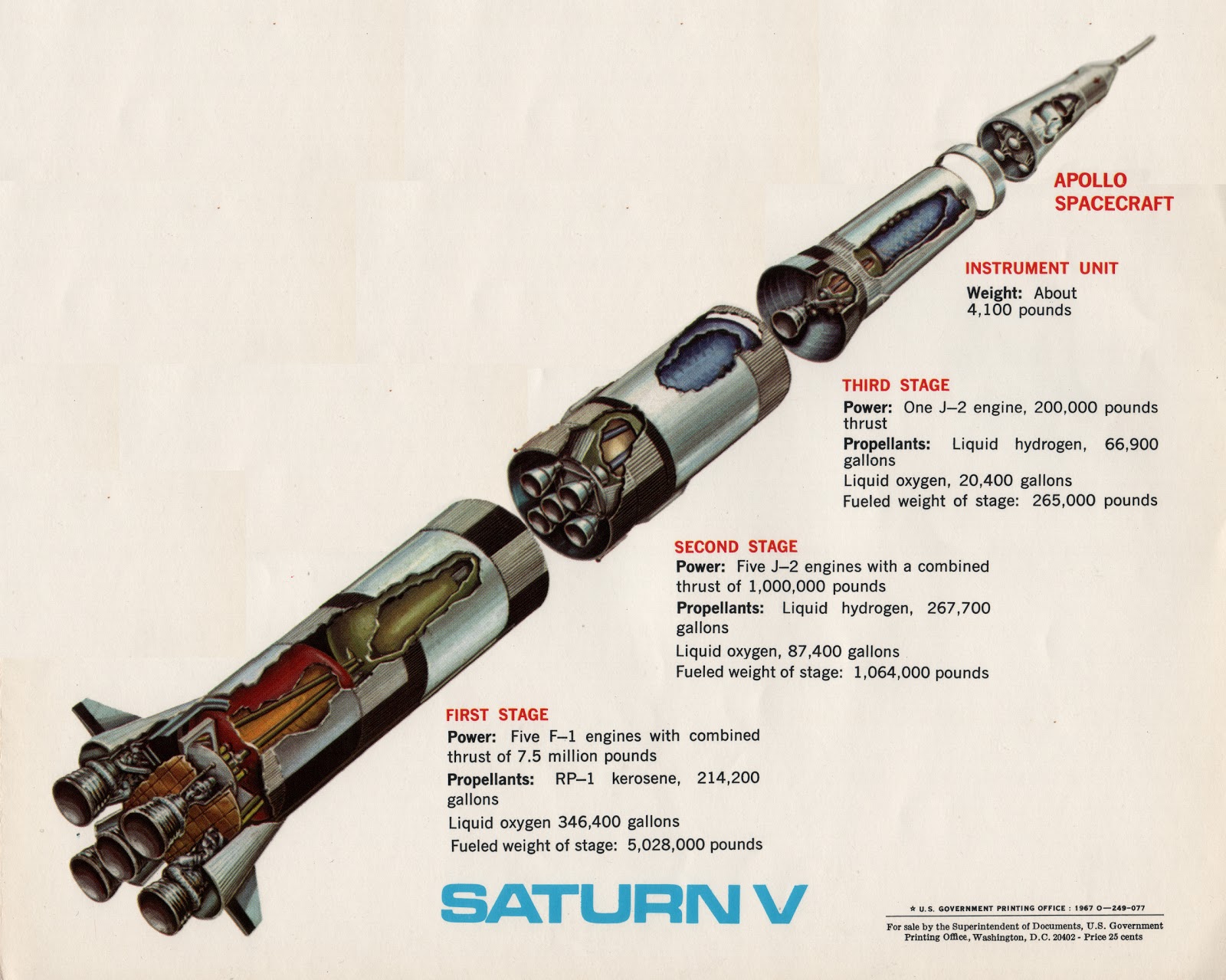
According to a retrospective timeline on the auto brand’s history, “Phil Garcia, chief designer–Advanced Studio, GM Design Studio–is credited with the selection of the ‘Saturn’ name (Saturn refers to the Saturn rocket that carried Americans to the moon during the space race with the USSR. The Saturn small car project’s goal is to design an American vehicle that can beat the Japanese in the small-car race.).”
Originally, the company only made three versions of a single car (SL, SC, and SW), and it actually referred to all three as Saturns. While not identical, the brand’s font strongly resembles the font used on the Saturn V, the biggest rocket of the series.
Thus, the sweeping arc could be seen as a rocket plume circling a planet–either Saturn, the moon, or Earth. Really, the logo could represent both the rocket and the planet. How about that!
![]()
Enjoy learning about the Saturn logo? Check out the rest of The News Wheel’s “Behind the Badge” series to learn about other auto brand logos.
Smart Suggestions: Tips for the best used car shopping experience
News Sources: CarLogos.org and FansofSaturn.com
The News Wheel is a digital auto magazine providing readers with a fresh perspective on the latest car news. We’re located in the heart of America (Dayton, Ohio) and our goal is to deliver an entertaining and informative perspective on what’s trending in the automotive world. See more articles from The News Wheel.