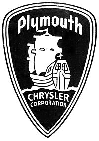
We recently discussed the Chrysler Pentastar logo and its perceived tie to its many divisions–including Plymouth. Known for some unforgettably iconic models over the years, like the Barracuda and Road Runner, the Plymouth brand had its own emblem its models proudly displayed–before its demise in 2001.
But what was Plymouth’s logo and where did the brand get it’s name?
How Plymouth Got Its Name
Back in 1928, Walter P. Chrysler unveiled the first model of a new line of lower priced vehicles meant to compete with Ford/Chevrolet. Successfully drawing buyers in the following years, the Plymouth marquee became part of the Chrysler repertoire for decades to come.
The brand name–Plymouth–was first explained by the newspaper article which leaked word of Plymouth’s first model. “Plymouth symbolises the endurance and strength, the rugged honesty, enterprise, and determination…of the Pilgrim band who were the first American colonists.” Indeed, the brand was purposely named after the English colony which was settled in Massachusetts in 1620.
How Plymouth Got Its Logo
Since the Plymouth brand name appealed to classic American patriotism, it only made sense the company’s emblem did so too. Therefore, what icon better reflected the determination of the Plymouth Pilgrims than their sailing vessel: the Mayflower.
Although Plymouth vehicles bore dazzling hood ornaments throughout its early years–including a winged mermaid–it wasn’t until two decades later that the public witnessed the first official emblem of the brand.
The design was undeniably fitting–a detailed depiction of the Mayflower as it sailed to the New World. Some renditions even included a coat of arms believed to be a local seal from where the Pilgrims landed. It adorned the brand’s models from 1949 until 1958, when it was replaced with model-specific badges.
A certain hood ornament was used occasionally, too: a sloping, tall triangle “rocket ship” logo with two colors, which later became Oldsmobile’s early logo.
In the 1990s, when Chrysler attempted to bring Plymouth through a renaissance, the Mayflower emblem was revived. However, it didn’t look like what people were expecting.
The new design looked more like a serene sailboat, passively floating on the water. Not only was this a docile rendition, it also looked somewhat feminine (potentially appearing suggestive). Thus, the brand’s revival failed as most male consumers rejected the new image.
Enjoy learning about the Plymouth logo? Check out the rest of The News Wheel’s “Behind the Badge” series to learn about other auto brands!
News Sources:Unique Cars and Parts, AllPar
The News Wheel is a digital auto magazine providing readers with a fresh perspective on the latest car news. We’re located in the heart of America (Dayton, Ohio) and our goal is to deliver an entertaining and informative perspective on what’s trending in the automotive world. See more articles from The News Wheel.


