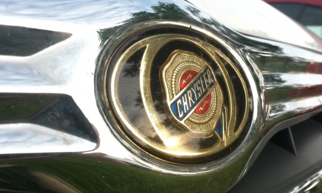
Despite being purchased by Fiat and forming a new corporation, Chrysler’s iconic logos still persist in our memory to this day–especially the company’s signature Pentastar. But what do Chrysler’s logos mean? You’ll be surprised to discover they’re not what you think.
[wptab name=’Ribbon Logo’]
Chrysler’s “Seal of Approval”
Back when Chrysler began in the 1920s, Walter P. Chrysler’s team of 18 men included Oliver Clark. Clark was the genius who designed not only the brand’s iconic silver-winged radiator cap (based on the Greek god Mercury) but the original Chrysler logo too.
From the mid 1920s to the mid 1950s, Chrysler models proudly paraded the brand’s first emblem: a “seal of approval.” The logo consisted of a wax seal with a ribbon peeking out from the lower right. The lightning bolts are actually Z’s, honoring the early Zeder prototype named for chief engineer Fred Zeder.
Clark said the seal was patterned off of state fair ribbons, synonymous with quality. The wax seal was retired in 1954.
From 1955 to the 1980s, Chrysler didn’t have a consistent badge on its vehicles. One common design, though, was a coat of arms. Other recurring elements included lions and crowns.
After briefly using a text-based badge in a futuristic font (1980s-early 1990s), the company went through a rebirth that included reviving the original seal, this time with wings around it that recalled the legacy of the winged radiator cap. Chrysler’s “winged” seal was used on the brand’s cars from 1996-2010.
However, the seal isn’t the only logo you probably associate with Chrysler…there’s also the iconic five-pointed star.
NEXT: The misunderstood meaning of Chrysler’s Pentastar logo
[/wptab]
[wptab name=’Pentastar Logo’]
Chrysler’s Five-Pointed Star
Chrysler’s Pentastar logo, created by the Lippincott & Marguiles design firm in the early 1960s, was selected from among over 800 other designs. According to its creator Robert Stanley, he wanted “something simple, a classic, dynamic but stable shape for a mark that would lend itself to a highly designed, styled product…We wanted something people could look at and say, ‘This was not done freehand.'”
This five-point star within a pentagon was used for Chrysler’s corporate identity to visually present the company to the public. It first appeared in company documents and advertisements before being subtly emblazoned on the passenger-side fender of Chrysler models to subconsciously attract attention. By 1981, all Chrysler divisions used the Pentastar exclusively–before it began being phased out in the 1990s to differentiate brand identities.
Most people recognize the pentagon for its five triangles. However, contrary to popular belief, these five “slices” did not represent the five company brands–Chrysler, Imperial, Plymouth, Dodge, and Dodge Trucks. In reality, Chrysler had numerous other brands that sold vehicles at that time–including Valiant, Hillman, Sunbean, and Singer–and the logo’s designers deny that interpretation.
So where do we get this idea? Blame Bob Hope’s variety show. The 1962 program was sponsored by the Chrysler Corporation and featured a graphic that labeled each logo segment with a different brand name. To this day, that interpretation persists. However, the creators only added the star to break apart the solid geometric shape, creating “certain tension and a dynamic quality.”
NEXT: Chrysler’s current badge and FCA’s surprisingly meaningful new logo
[/wptab]
[wptab name=’FCA logo’]
The Shape of Fiat Chrysler Automobiles
With the formation of Fiat Chrysler Automobiles in 2014, the entire corporation needed to adapt a logo that both parents could agree upon. The automotive conglomerate decided on an acronym that acknowledged its heritage but was still its own entity.
If you think FCA is simply a combination of letters, you don’t know about Chrysler’s official design story:
“The three letters in the logo are grouped in a geometric configuration inspired by the essential shapes used in automobile design: the F, derived from a square, symbolizes concreteness and solidity; the C, derived from a circle, representing wheels and movement, symbolizes harmony and continuity; and finally, the A, derived from a triangle, indicates energy and a perennial state of evolution.
That’s far more meaning than we first gave FCA credit for. It’s far more interesting than Chrysler’s current badge design, which looks like a rehash of the Aston Martin badge.
Enjoy learning about the Chrysler and FCA logos? Check out the rest of The News Wheel’s “Behind the Badge” series to learn about other auto brands!
[/wptab]
[end_wptabset]
News Sources: Allpar, Logo History, The Wall Street Journal, Chrysler
The News Wheel is a digital auto magazine providing readers with a fresh perspective on the latest car news. We’re located in the heart of America (Dayton, Ohio) and our goal is to deliver an entertaining and informative perspective on what’s trending in the automotive world. See more articles from The News Wheel.
