![]()

If you had to pick the most boring automotive brand logo on the road today, you might think of Honda’s simplistic “H” or Nissan’s hamburger-shaped badge…but most likely you’re going to choose Kia’s text-based oval. Apart from the horizontal line of the “A” missing, there’s nothing terribly creative about the design–at least Ford’s emblem has a distinct script and shade of blue.
To some people, this simplicity actually makes it the best car logo around, ironically. Being a plain but streamlined example of textography, the logo’s meaning is apparent to everyone who sees it: Kia. From a marketing perspective, that’s true.


But that doesn’t change the fact that there are numerous other more interesting car logos around, including Kia’s own Korean logo.
You didn’t know Kia uses a different logo in Korea? You’d better keep reading to see what you’re missing–and prepare to be jealous.
Kia’s International Logo Design Vs. Kia’s Korean Logo
Kia, the oldest automaker in Korea, began in June 1944 as a manufacturer of bicycle components. Chul-Ho Kim, who founded the company, had a specific name in mind for the company. According to the automaker, the name “Kia” is a combination of “ki” (起) meaning arise or come up out of and “A” (亞), signifying Asia. Thus, Kia (起亞) can be defined as “rising out of Asia.”
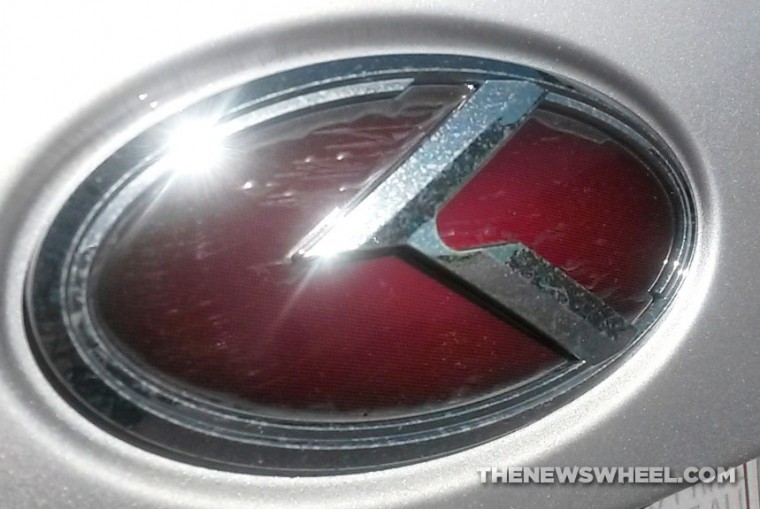
Kia has two logos: the text-based symbol for international use and another for only South Korea. The latter is known as the “K” logo:
![]()

This logo has been used over the years for some models sold in Korea, but it’s made very few appearances outside of Asia. The stylized “K” is undeniably appealing, especially its use of the diagonal double-line and lack of a vertical backbone. It’s slick and kinetic, and suggests high-excitement driving (like the double hash marks of Dodge’s new logo).
This logo even inspired an after-market imitation badge (known as the 3.0 K emblem) some Kia owners purchase to replace their text-based Kia badge with–although plenty of debate has surrounded this badge’s legitimacy.

The after-market 3.0 K badge for people who want a cooler Kia logo
According to Kia, the oval in both symbols represents the earth and the 3D lettering “signifies Kia’s dynamic growth in the world market.” Kia’s official color–red–emphasizes a strong determination to move forward.
![]()

Enjoy learning about the Kia emblems and name? Check out the rest of The News Wheel’s “Behind the Badge” series to learn about other auto brands!
News Sources: Logo design buzz, Kia Motor Co

The News Wheel is a digital auto magazine providing readers with a fresh perspective on the latest car news. We’re located in the heart of America (Dayton, Ohio) and our goal is to deliver an entertaining and informative perspective on what’s trending in the automotive world. See more articles from The News Wheel.