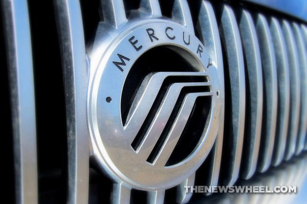
Ever wonder what influenced the formation of Mercury, including its name and logo?
[wptab name=’Company History’]
History of the Mercury Brand
Henry Ford never cared for vehicle styling, preferring straightforward functionality in his company’s automobile line. It eventually became apparent to the company that to remain competitive in the ever-evolving automotive market, attention had to be made to the design appeal of auto models. Thus, Henry’s son Edsel founded the Mercury Division in 1938 to appeal to working professionals whose salaries fit somewhere between practical Fords and upscale Lincolns. The mid-level brand relied on a heavy amount of chrome and interior luxury to stand out.
After Edsel’s death in 1943, father Henry Ford merged Mercury with Lincoln into a conglomerate Division focused on premium models. Mercury became most successful in the 1950s for stretching and lowering Ford’s platforms into rebadged versions. In the 1950s Ford briefly introduced a sister line, named Edsel, which was intended to compete with Oldsmobile but lasted only two years after immediately tanking.
Despite producing some good muscle cars and minivans over the years, Mercury vehicle sales declined heavily by the 21st century, compelling Ford to pull the plug in 2010.
NEXT: Discover the meaning behind the Mercury name and emblem!
[/wptab]
[wptab name=’Logo Meaning’]
On a Wing and a Prayer
Mercury’s name comes from the Roman god known for his speed and winged sandals/hat. Known as Hermes in Greek mythology, Mercury was also the name for a planet and an element. This was a fitting choice for an automobile brand as the character was the swift messenger of the gods whose main function was commerce and transit. Edsel’s use of the name Mercury was probably due to the success of the Lincoln Zephyr–named after the god of wind–a few years earlier.
| The first Mercury logo was a side profile of the Roman god with his iconic winged hat. It went through many tweaks and iterations, functioning well as a hood ornament. | |
|
Photo: Gust via CC |
During the brand’s success in the 1950s, the emblem became a massive letter “M” (known as the “The Big M”) with horizontal bars extending out from the bottom. |
| From the 1960s to the early 1980s, Mercury used a cat logo in conjunction with its “Sign of the Cat” ad campaign, which was inspired by its popular Cougar vehicle. Certain luxury models featured a red-and-blue shield instead. | |
| In the 1980s, the current logo arrived. With nicknames like the “waterfall,” “winding road,” and “hockey stick,” the emblem took on multiple meanings, including being a depiction of Mercury’s winged helmet. The three-arc design suggests mobility. It remained silver until it was retired, the color of the element Mercury. |
Enjoy learning about the Mercury logo? Check out the rest of our “Behind the Badge” series!
News Sources: eHow & CarLogos.org
[/wptab]
[end_wptabset]
Aaron is unashamed to be a native Clevelander and the proud driver of a Hyundai Veloster Turbo (which recently replaced his 1995 Saturn SC-2). He gleefully utilizes his background in theater, literature, and communication to dramatically recite his own articles to nearby youth. Mr. Widmar happily resides in Dayton, Ohio with his magnificent wife, Vicki, but is often on the road with her exploring new destinations. Aaron has high aspirations for his writing career but often gets distracted pondering the profound nature of the human condition and forgets what he was writing… See more articles by Aaron.