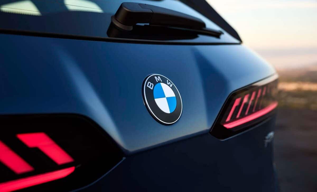
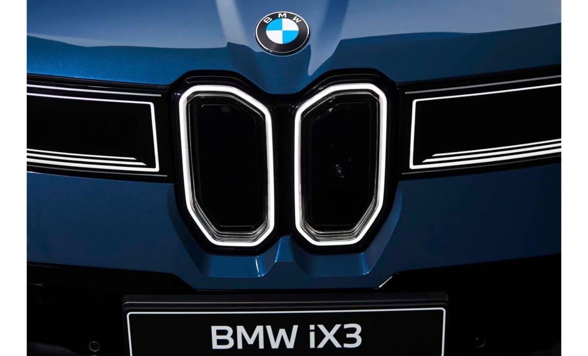
It’s the kind of change you wouldn’t notice unless someone pointed it out. A walk around the upcoming 2027 BMW iX3, and something might feel… slightly different. Not the proportions, not the stance, but the badge. BMW has quietly redesigned its iconic roundel, and it says a lot about where the brand is headed.
In a world where carmakers often chase attention with bold, sometimes controversial restyling, BMW’s decision to tweak its logo with such restraint feels almost counterintuitive. But maybe that’s the point.
A Gentle Evolution of a Century-Old Symbol
The new badge debuts on the 2027 iX3, a fully electric SUV that will help launch BMW’s much-anticipated Neue Klasse platform. At first glance, nothing seems out of place: the familiar blue-and-white quadrants, the circular frame, the three-letter abbreviation, all there. But gone is the inner chrome ring, and the once-glossy black outline is now matte. It’s subtle enough that most observers won’t register the change unless they’re told.
According to BMW Blog, the redesign will start appearing across the lineup from February onwards. The iX3 is the first to carry it officially, a logical choice, as this model embodies the next phase in BMW’s electric strategy.
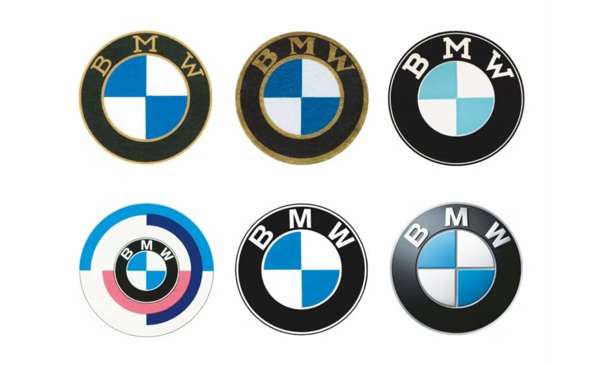
A Logo Tied to Bavarian Heritage, Not Aviation
Despite common belief, BMW’s emblem isn’t based on an aircraft propeller, even though the brand began as an aircraft engine manufacturer. The real story goes deeper into Bavarian heraldry. The blue-and-white segments are inspired by the flag of Bavaria, a detail often lost in the more popular, aviation-tinged origin myth.
Over the decades, the roundel has evolved slowly. The typography, ring color, and finishing have changed, but the core has remained untouched. The most dramatic shift before this came in 2020, when BMW unveiled a transparent version of the logo for digital and marketing use, a design that drew mixed reactions and was never widely adopted on vehicles.
In that sense, the 2027 iX3‘s logo update feels like a compromise between modernity and continuity. It nods to change without erasing tradition.
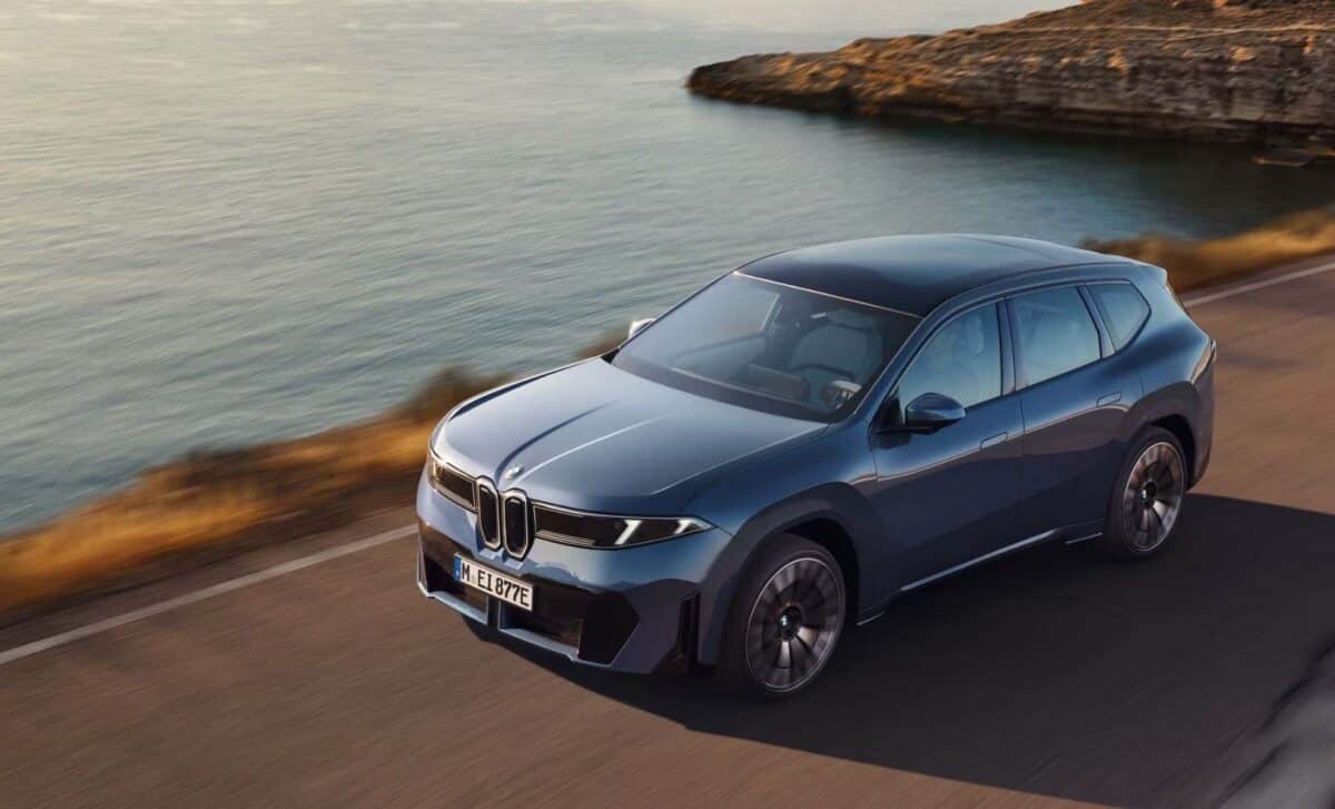
A New Design Era with Neue Klasse
The badge is just one part of a broader reset. The Neue Klasse design language, set to define BMW’s next generation of EVs, aims to reconnect with a cleaner, more restrained aesthetic. Critics have often cited recent BMW designs, particularly the oversized grilles on models like the current M3, as examples of form overtaking function.
With the Neue Klasse and its minimalist badge, BMW seems to be recalibrating. There’s a hint of the brand’s late-1990s and early-2000s golden age here, when models like the E39 M5 or E46 M3 struck a rare balance between performance, usability, and style.
Reading Between the Lines
Changing a brand logo is never trivial, especially not for a marque like BMW, whose visual identity has spanned more than 100 years. While some might dismiss this move as cosmetic, it reflects a deeper intention: make innovation feel familiar.
In a way, this quiet redesign contrasts with the increasingly bold gestures we’ve seen from other carmakers, such as Kia’s sharp new script, or Renault’s angular diamond. BMW is choosing a different route: not shouting, but refining.

