![]()
Back in 1903, the world changed forever when the legendary Henry Ford began his own automotive company in Dearborn, Michigan. Today, the brand has over 100 manufacturing facilities across more than 30 countries, with every model parading the iconic blue oval.
But where did the design for this “hallmark for reliability and economy” come from? Discover what lies inside the Ford logo!
Origins of the Ford Signature and Blue Oval
The question often wondered about the Ford logo is if the script of the brand name is Henry Ford’s handwriting. The answer is no, it’s not.
It was created by the company’s first chief engineer/designer Childe Harold Wills. Ford was looking for a logo for his vehicles, so Wills, a friend of Ford’s who designed and printed business cards, used the calligraphy from his own cards to stylize the letters.
Here are the rest of the Ford emblems you may have seen over the years–including one that was never released:
| 1903-1906 | The very first Ford logo was much different from the simple, streamlined image used throughout the twentieth century. This one was a circle with a fashionable art nouveau border. | |
| 1907-1912 | 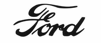 |
The first signature-based Ford logo is used resembling the script we know and love today. |
| 1912 | This brief and unsuccessful Ford design put the brand signature on top of an orange/dark blue winged pyramid. Although intended to show the product’s speed, grace, and stability, the logo was quickly removed after Henry Ford expressed his dislike of it. | |
| 1912-1927 | The Ford signature becomes encapsulated in an oval. While 1912 was when this new design became widely used, it first appeared in 1907 by the original Ford Motor Company Limited of Great Britain to identify UK Ford dealers. | |
| 1927-1957 | After the oval was introduced, it didn’t take long before it assumed its iconic royal blue color, though its shape was rounder than today’s oval is. | |
| 1957-1976 | Instead of an oval, the Ford logo took on an odd shape for a couple decades–something resembling a lemon. During this time, the logo was only used on company communications and unique crests were favored on vehicles. | |
| 1976-present | The blue oval returned in the 1970s at the relative shape it is today. For the 100th anniversary of the brand, the blue logo received a white tint with smooth 3D shading, as well as the official title of “Centennial Blue Oval.” |
Despite looking consistent throughout the years, one drastically different Ford logo was proposed in 1966 but never used: a sleek, modernized version of the Ford text graphic. This design was constructed by legendary logo design Paul Rand, who made logos for IBM, UPS, ABC, and Enron. Despite wanting to modernize the logo, Henry Ford II–who hired Rand–decided this design was too radical of a change and rejected it.
![]()
Imagine how close we were to not having the iconic Ford oval and signature we have today!
![]()
Enjoy learning about the Ford logo? Check out the rest of The News Wheel’s “Behind the Badge” series to learn about other auto brands!
News Sources: Ford Motor Company via Anglia Models, Business Insider, The New York Times

Aaron is unashamed to be a native Clevelander and the proud driver of a Hyundai Veloster Turbo (which recently replaced his 1995 Saturn SC-2). He gleefully utilizes his background in theater, literature, and communication to dramatically recite his own articles to nearby youth. Mr. Widmar happily resides in Dayton, Ohio with his magnificent wife, Vicki, but is often on the road with her exploring new destinations. Aaron has high aspirations for his writing career but often gets distracted pondering the profound nature of the human condition and forgets what he was writing… See more articles by Aaron.
