It’s a shame the defunct Pontiac brand didn’t make it out of the Great Recession. After developing a hundred-year legacy of stylish, affordable vehicles, the automaker’s doors were closed by General Motors in 2010.
Even though no new Pontiac models are arriving at dealerships anymore, the “zombie” brand still lives on in its recognizable, pointed emblem. The Pontiac logo has a fascinating history; far more than an upside-down red triangle, the insignia has its roots deep in the manufacturer’s history.
That’s why we’re unveiling the secrets of Pontiac’s origins.
Wash Up: Tips for cleaning car seats
What Are Pontiac’s Origins?
Learning the meaning behind the Pontiac emblem begins with the brand’s name.
 The company was named after the town of Pontiac, Michigan, in Oakland County, where Albert G. North and Harry G. Hamilton founded the Pontiac Buggy Company (aka the Pontiac Spring and Wagon Works) in 1893. They changed their business from horse-drawn carriages to motor vehicles in 1906 and took on the Oakland Motor Car name. The company was purchased by General Motors a couple years later.
In 1926, GM introduced a companion marque to GM’s Oakland line: Pontiac. The brand was named after Pontiac, Grand Chief of the Ottawa Native Americans, who was famous for his rebellion against Fort Detroit (the British) in 1763. Because of this, Native American imagery was used in marketing throughout the early life of the brand.
Getting to the “Point” of the Iconic Pontiac Logo
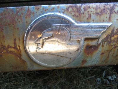
The first logo of this “athletic” automotive brand was a Native American headdress atop the titular Native American warrior, Chief Pontiac. It incorporated the same shield shape as the Oakland emblem, a fitting tribute as Pontiac absorbed Oakland in the early 1930s.
The same “Indian Head” emblem was also used as a hood ornament.

The original Pontiac logo
Photo: Garret Voight via CC
During the 1930s, a silver shield subtlety crept into the logo, surrounding the silhouette of a streamlined, less “cartoonish” Native American.

Pontiac logo becomes more stylized
Photo: John Lloyd via CC
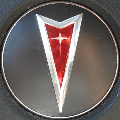
In 1956, the Native American head design was retired. In order to appeal to youthful consumers looking for affordable performance vehicles, the old-fashioned Native American profile was replaced with a subtler, elegant emblem: a downward-facing, red arrowhead known as the “Dart.” While traces of the new logo began appearing in 1957, including the stars along the Star Chief model’s body, the badge didn’t officially debut on the Bonneville’s split grille until the 1959 wide track model.

The Pontiac logo which retired in 2010
Photo: Tom Magliery via CC
While there’s no official explanation what the star means (apart from paying homage to the Star Chief) or why the logo is red, many speculate it’s a nod to symbols prevalent in Native American art. Before the 1950s, the Pontiac did flaunt many Native American names and iconography in its lineup.
Enjoy reading about Pontiac? Learn the secrets of other automotive logos in our Behind the Badge series!

Up Your Bucks: Car cleaning ideas to improve resale value
News Source: Dinesh, autoevolution, & CarLogos.org

The News Wheel is a digital auto magazine providing readers with a fresh perspective on the latest car news. We’re located in the heart of America (Dayton, Ohio) and our goal is to deliver an entertaining and informative perspective on what’s trending in the automotive world. See more articles from The News Wheel.


