With the sixth-generation Camaro on its way, we take a look at the second-gen
© General Motors
As we rapidly approach the debut of the sixth-generation Camaro, Chevrolet is looking back at the first five installments in the classic American muscle car’s history. Five different designers have been asked to share their thoughts on each of the vehicle’s five different generations.
First, GM Global Design VP Ed Welburn analyzed the first-gen Camaro, paying special attention to the 1969 model. For the second-gen Camaro, executive director of design for Chevrolet Trucks and Global Architecture Ken Parkinson provides his insights regarding the 1970 Camaro.
“I’ve always loved the ’68 Camaro, but for some reason it was the second–gen car I’d find myself sketching during high school math,” says Parkinson (who currently owns a ’68). “It was a radical departure from the first-gen. For the first time, it was built on its own dedicated architecture, which gave the design team the freedom to create a pure expression. What that team created was a powerful expression of American muscle, influenced by a European grand-touring aesthetic. There was simply nothing else like it.”
“The second-gen car is pure Camaro, with a dramatic proportion and lean, muscular form,” Parkinson added. “You won’t confuse it with the first generation, but it is unmistakably a Camaro from every angle.”
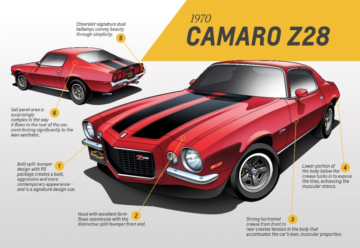
Over the course of its 12 model years, the second-gen Camaro changed dramatically, but Parkinson is partial to the early, circa-1970-1973 models. His “design analysis highlights” include:
- The strong horizontal crease running the length of the body sides creates strong tension and forward motion in the body
- Below this horizontal crease, the body tucks in dramatically, exposing the tires for a more muscular appearance and great stance
- The bold split-bumper design on RS models was a signature feature that gave the car an aggressive and more contemporary design, arguably one of the greatest fronts on any car
- Great hood design with lots of form exaggerating the power of the V-8 underneath
- The upper portion of the design is placed rearward on the body, giving it a significant amount of “dash to axle” – a key to the car’s dramatic proportion
- The sail panel at first glance is a clean, simple statement, but on closer look is also a sophisticated complex shape that flows into the rear quarter of the car, cradling the backlight
- The Chevrolet-signature dual taillights are simple and beautiful.
Stay tuned for part three in this continuing series!
The News Wheel is a digital auto magazine providing readers with a fresh perspective on the latest car news. We’re located in the heart of America (Dayton, Ohio) and our goal is to deliver an entertaining and informative perspective on what’s trending in the automotive world. See more articles from The News Wheel.

