 Few automotive emblems are as recognizable and revered as the ram’s head logo. Although it started off as the badge on Dodge vehicles and has since become the symbol adorning RAM trucks, the history of Dodge logos goes back much further than the horned mammal. Many fascinating, mysterious logos have been used by Dodge throughout the past hundred years, including the brand’s newest emblem.
Here’s your chance to learn all about them.
[wptab name=’Badge Evolution’]
History of the Dodge Logos
The Dodge Brothers Company was founded in 1900 by siblings John Francis and Horace Elgin. The business began as an automotive parts supplier before producing its first vehicle in 1914. After the brothers passed away in 1920 and the company was “driven” into financial trouble, Chrysler purchased the Dodge Brothers Company, dropping “Brothers” from the name. The first appearance of the ram hood ornaments happened shortly after.
Below are the notable emblems used by Dodge before the ram logo was introduced:
| Six-Pointed Star (1914-1938): For the first five years, the Dodge Brothers used a round shield symbol with their initials “DB” interlocked. In 1914, an updated logo was revealed adding two interlocking triangles (black and white), forming what many pointed out as Star of David–a Jewish symbol–despite the brothers not being Jewish. Some claim this was on purpose to irritate competitor Henry Ford (a known anti-Semite), while others assert that Ford and the Dodge brothers were friends. The brothers died in 1920 before explaining the emblem’s meaning, but Chrysler claimed it was two interlocking delta symbols. | |
 Photo: Wikipedia via CC |
Forward Look (1955-1962): After the Dodge family crest was used between 1941-1957, Virgil Exner designed Dodge’s “Forward Look” logo: two overlapping boomerang shapes that suggested progress and forward motion. The design was heavily influenced by developing rocket propulsion technology and was named after the redesign campaign being used on the Chrysler Corporation’s vehicles. |
| Fratzog (1962-1976): The next symbol, a fractured deltoid shape commonly compared to a rocket or triangle, was named the Fratzog. If you’re wondering what that word means (it sounds German, doesn’t it?), it’s totally meaningless. The designer made up the gibberish term due to being obligated to come up with a name. Again, there are still many conspiracy theories about it… | |
| Chrysler Pentastar (1982-1992): For a decade, Dodge adopted Chrysler’s Pentastar logo on its vehicles, which had been used for corporate identification since 1962. To differentiate itself, Dodge’s Pentastar was red, while Chrysler-Plymouth’s was blue. It was originally designed by Lippincott & Marguiles. |
By the early 1990s, Dodge had been undergoing a revitalization of its truck lineup and needed a new logo to set the brand apart as something powerful. What we got was the ram’s head emblem.
NEXT: How Dodge pushed through the crowd with its ram logo
[/wptab]
[wptab name=’RAM Emblem’]
Introduction of RAM Emblem
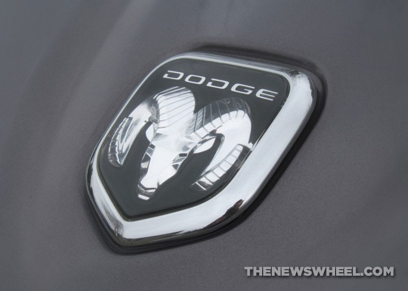
![]() In the 1970s, the ram hood ornament was reintroduced on various models, including heavy-duty tractors, hearkening back to their use in the 1930s. As the story goes, Avard T. Fairbanks originally designed the ram radiator cap in the late 1920s. When Walter P. Chrysler was skeptical of the idea, Fairbanks asked what a person’s first thought would be upon encountering a ram in the wild. Chrysler’s response “Dodge!” fit perfectly.
In the 1970s, the ram hood ornament was reintroduced on various models, including heavy-duty tractors, hearkening back to their use in the 1930s. As the story goes, Avard T. Fairbanks originally designed the ram radiator cap in the late 1920s. When Walter P. Chrysler was skeptical of the idea, Fairbanks asked what a person’s first thought would be upon encountering a ram in the wild. Chrysler’s response “Dodge!” fit perfectly.
The Ram, the ancient symbol of Aries, signifies authority, force, fearlessness, and virility.
As the ram’s head began appearing on redesigned Dodge pickup trucks, the brand began referring to them as Dodge RAM trucks. By the 1990s, hood ornaments were out of fashion and the ram’s head needed to be adapted into a consistent, identifiable badge. Thus, the ram logo was used on almost every Dodge model between 1993-2010.
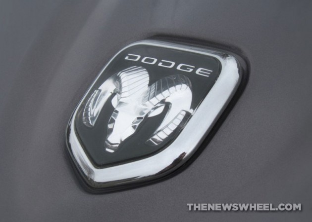
RAM became its own brand when Fiat acquired Chrysler in 2009. Because the ram’s head badge was more appropriate for the strength and power of RAM trucks, Dodge relinquished the logo to the pickup brand. After all, truck fans are undeniably obsessed with iconography over other vehicle owners (you don’t see Honda or Toyota customers wearing ball caps and t-shirts bragging over who has the better hatchback).
There is one notable similarity that drives die-hard RAM truck fans crazy: the striking resemblance of the ram’s head to a uterus.
![]()
Once RAM began exclusive use of the logo for the 2011 model year, Dodge needed a new image.
NEXT: Dodge revitalizes its youthful reputation
[/wptab]
[wptab name=’New Dodge Logo’]
Dodge’s New Logo Changes the Brand’s Image
When Dodge needed a new logo after giving up the iconic ram’s head, the company turned to the Wieden & Kennedy ad agency, famous for its Nike design.
Dodge wanted to ditch the all-powerful reputation of the ram in favor of a “forever young attitude” that emphasized the brand’s performance car history. Thus, the designers turned to the popularity of Chrysler’s Street and Racing Technology (SRT) group, which developed the Dodge Viper.
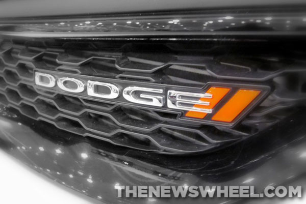
The result was a simple text-based badge with two diagonal, redish-orange hash marks after the Dodge script. The twin slanted slashes of the SRT performance brand suggested speed and agility—iconography immediately recognizable by racing fans. The silver text represents purity, dignity, and grandeur, while the red stands for passion and excitement.
While it was originally intended to be limited to digital and print marketing, Dodge’s new logo began appearing on vehicle grilles as a badge for the 2012 model year—after the short-lived shield-with-crosshairs design of the 2011 lineup.![]()
Enjoy learning about the Dodge and RAM logos? Check out the rest of our “Behind the Badge” series!
News Sources: Wikipedia, Allpar, Car and Driver, The Jewniverse, Redline Dodge, & The Dodge Brothers Club
[/wptab]
[end_wptabset]
![]()
The News Wheel is a digital auto magazine providing readers with a fresh perspective on the latest car news. We’re located in the heart of America (Dayton, Ohio) and our goal is to deliver an entertaining and informative perspective on what’s trending in the automotive world. See more articles from The News Wheel.
