Toyota takes a lot of pride in its current logo, even attributing much of the company’s success to the recognizable emblem. This pride is well-founded, as the company’s emblem quickly became one of the most recognizable automotive logos around the globe.
The Japanese automaker put a lot of thought into its name and emblem, including many hidden meanings. Want to know what secret messages are in the Toyota logo? Read on!
[wptab name=’Name Origins’]
The History of Toyota’s Name and Original Logos
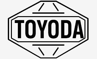
At the beginning of the twentieth century, Sakichi Toyoda was making looming machines in Japan. By the 1930s, he started a company to manufacture automotive vehicles: “Toyoda,” aptly naming it after the family. The earliest vehicles produced by the Toyoda company featured this simple badge:
In 1936, the company held a public contest to gather suggestions for a revamped logo, in an effort to move the company away from an independent, family-owned business to a full corporate enterprise.
Out of 27,000 entries, the winning design used the Japanese katakana letters ‘to’, ‘yo’, and ‘ta’ to spell ‘Toyota’. The name change was primarily based on “jikaku” (numerology that associates good/bad fortune with the number of brush strokes in a name): instead of 10 brush strokes in the family name, ‘Toyota’ in katakana only used eight, which was the number of wealth and good fortune. Hence, the name was officially changed. You could say the resulting success was a “stroke of luck!”
Linguists point out that in Japanese “Toyo” means “fertile/plentiful” and “ta” means “rice.” In some Eastern cultures, an abundance of rice is a sign of prosperity. It could be argued that the terms “rice mobiles” or “rice rockets” come from this.
NEXT: What hidden meanings are buried in Toyota’s current logo?
[/wptab]
[wptab name=’Current Logo Meaning’]
Analysis of Toyota’s Current Emblem
The currently elliptical logo used by Toyota today took five years to develop and was revealed in October 1989 to commemorate Toyota’s 50th anniversary. The company wanted to create a new logo that established a strong identity for Toyota as it grew in markets outside of Japan. This badge first debuted on the luxury Celsior, released elsewhere as the Lexus LS400.
The two inner, perpendicular ellipses symbolize the merging of the hearts of customers and the company (also said to be the product). That mutual relationship is surrounded by the greater oval of technological progress and the whole market which embraces Toyota. Each oval has a different stroke thickness to reflect brush strokes in Japan’s calligraphy. Another claim is that the three ovals represent the three cultural aspects of the company: freedom, team spirit, and progress.
Even the negative space in the logo represents something: boundless opportunities and infinite values in the quality/enjoyment of the company’s products.
The most obvious shape that can be seen in the badge is the letter “T” but every letter is actually intentionally hidden in there. Can you find them?
Additionally, some people point out the emblem’s resemblance to a steering wheel, while others identify it as the eye of a needle, as Toyota’s original parent company produced sewing machines. The logo’s main color has been red and white, though metallic grey and blue are often used too. Its symmetrical layout can be recognized both head-on and in a rear-view mirror.
Enjoy learning about the Toyota logo? Check out the rest of our “Behind the Badge” series!
News Sources: Toyota Global, Toyota UK, Famous Logos, and Japan Travel Cafe
[/wptab]
[end_wptabset]
The News Wheel is a digital auto magazine providing readers with a fresh perspective on the latest car news. We’re located in the heart of America (Dayton, Ohio) and our goal is to deliver an entertaining and informative perspective on what’s trending in the automotive world. See more articles from The News Wheel.


